Hurl. Mountain Delivery.
Hurl was a branding project that challenged me to think outside the box and create a visual identity for a unique and daring delivery service. The brand needed to embody the spirit of adventure, the thrill of the climb, and the expertise needed to deliver goods to the top of a mountain.
Overview

I approached this project with a focus on motion, art direction, and typography. I wanted the branding to convey a sense of excitement and energy, while also showcasing the rugged terrain and unique challenges of mountain delivery. I used bold typography and bright colours to grab the viewer's attention and convey the brand's daring and adventurous spirit.
Context
To bring the concept to life, I created a series of promotional materials, including social media graphics, video ads, and print materials. Each piece was carefully designed to showcase the brand's unique identity and stand out in a crowded marketplace.


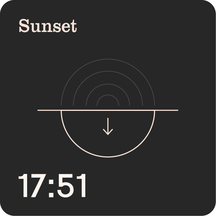
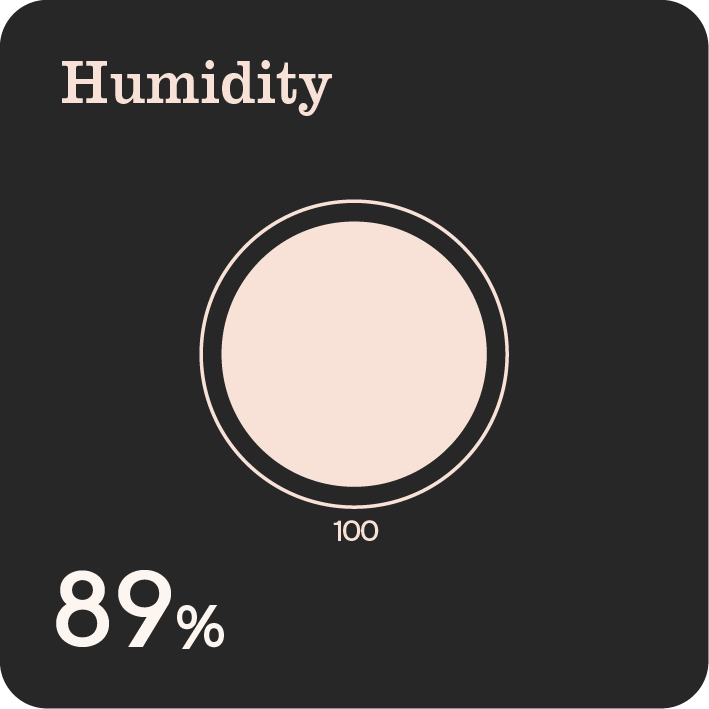
The Hurl app was designed to meet the unique needs of mountain delivery and provide a seamless experience for both delivery recipients and explorers alike. The app includes features such as altitude, wind speed, temperature, and more, all tailored specifically for the mountain environment. Through the use of satellite connectivity, the app can provide real-time data that helps delivery drones navigate the challenging terrain and deliver with precision. But the app isn't just for delivery; it also includes a range of tools and resources for mountain explorers, including maps, guides, and weather forecasts, making it a go-to resource for anyone seeking adventure in the mountains.
App
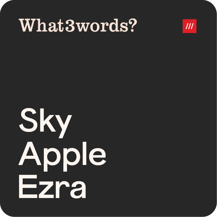
One of the key features of the Hurl app is its integration with "What3words?", a unique geocoding system that provides precise location information using just three words. This integration allows users to easily and accurately communicate their delivery location, even in remote mountain areas where traditional address systems may not be available. By leveraging the power of "What3words?" and combining it with satellite connectivity, the Hurl app provides a seamless, reliable, and safe delivery experience, no matter how remote or challenging the mountain terrain may be.


Experimentation with motion was a key aspect of this project. In the app, I explored different animation options for the delivery process to make it visually engaging and easy to understand. I used motion graphics to demonstrate the journey of the drone, from takeoff to delivery. This not only helped to explain the process to the user but also added an element of excitement and adventure to the experience.
In terms of branding and advertising materials, I experimented with different motion design techniques to bring the Hurl logo to life. I created several animations that showcased the different aspects of the brand, such as the mountainous terrain, the delivery drones, and the app's connectivity features. I also experimented with typography, using motion design to make the text more dynamic and engaging. Through trial and error, I was able to create a motion design style that captured the adventurous spirit of the Hurl brand while also conveying its key messages clearly and effectively.
Motion


Creating the branding for Hurl was a challenging but rewarding process. From the outset, I knew that I wanted to incorporate the theme of mountains into the design, but I also wanted to represent the connectivity and precision of the delivery service. After numerous iterations and experiments, I settled on a logo that combines the mountain theme with the Hurl connectivity aspect. The left side of the logo features an abstract representation of mountains, while the right side features a simplified depiction of the Hurl connectivity system. The top point of the mountain logo represents the person making the order, while the bottom point of the Hurl side represents the ‘Hurl Hub’. When an order is complete, using motion both of these points transform from circles into squares, symbolising the successful completion of the delivery.
During the branding process, I also experimented with different options for the mountain logo, ranging from more illustrative to realistic images. However, I ultimately decided on a more abstract representation to ensure that the logo would translate well into motion. With the final logo design in place, I was able to develop a strong visual identity for Hurl, that is both distinctive and memorable.
