Swatch
Swatch is a legendary Swiss watch company that has made a significant impact on the watch industry. When I heard about Prospect100's collaboration with Swatch to design a monogram for their special anniversary year, I was thrilled to participate and showcase my design skills.
The challenge was to create a monogram that reflects the essence of the Swatch brand and its significance in the watch industry. After exploring several concepts and versions, I decided to focus on the meaning of the name 'Swatch', which is 'Second Watch'.
Overview

To capture this idea, I designed the monogram using two half-circles that form the letter 'S', representing the concept of time and seconds. I also incorporated the Swiss cross, which is a symbol of quality and a promise of excellence that is deeply ingrained in the Swiss watchmaking tradition.
The final result is a monogram that captures the essence of Swatch and its significance in the watch industry. It was an honour to participate in this competition and contribute to the celebration of such an iconic brand.
I am always looking for new challenges and opportunities to explore my creative skills, and this project was no exception. I enjoyed the process of creating a meaningful and impactful design that reflects the values and identity of the Swatch brand.
Idea


The Swatch project was all about capturing the essence of Swiss design while also bringing a fresh and modern perspective to the brand. This meant finding a balance between honouring the brand's heritage and pushing it forward into the future.
To achieve this, I started by researching Swiss design principles and exploring different iterations of the logo. I created over 50 different variations, each one exploring different ways to capture the essence of Swatch in a fresh and modern way.
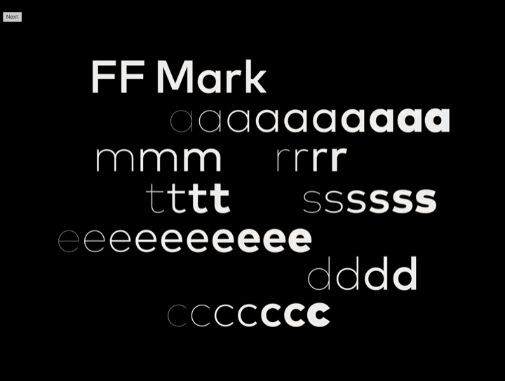
Process
Throughout the process, I made sure to keep the brand's heritage and history in mind, making sure that the final logo was a true representation of the Swatch brand and its legacy.